
Net Tech
Designer: Robin
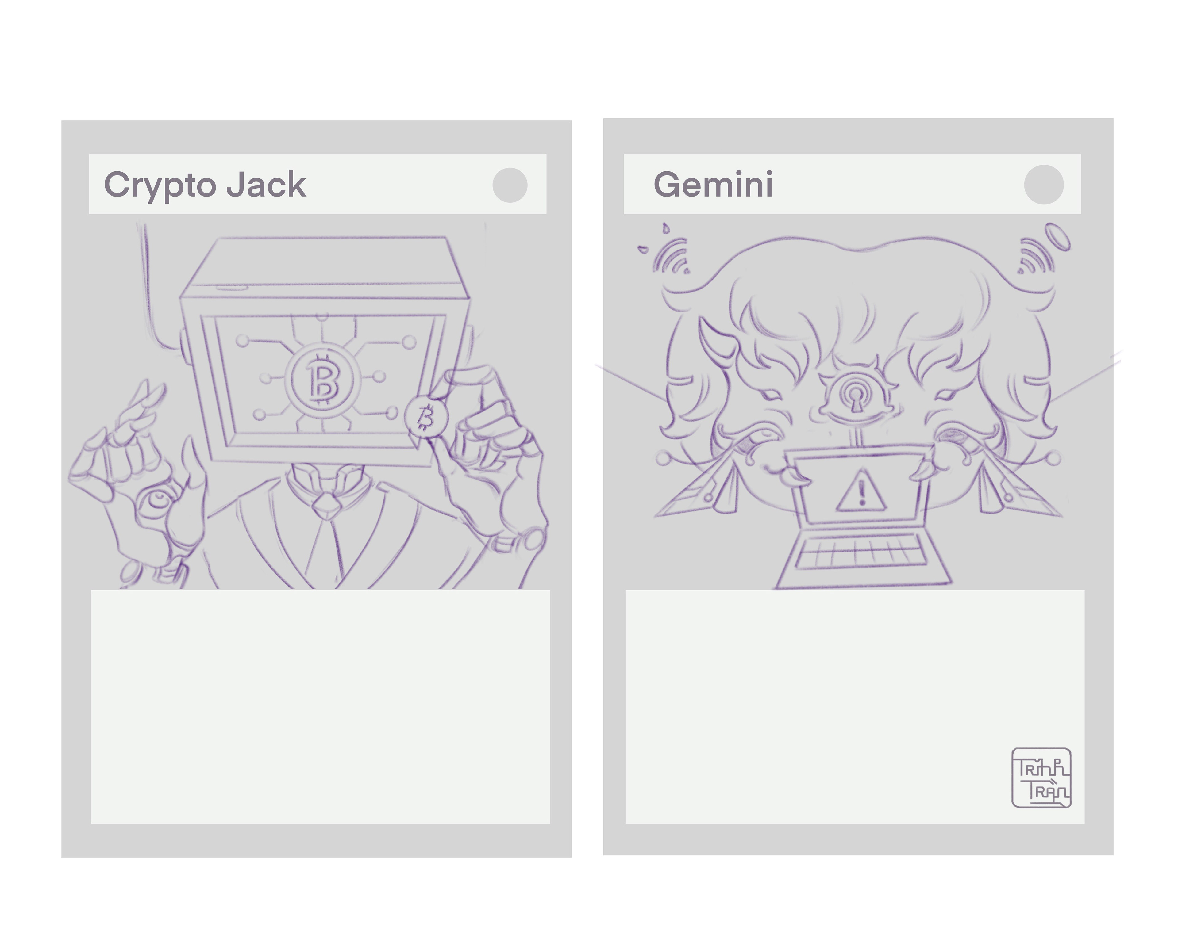
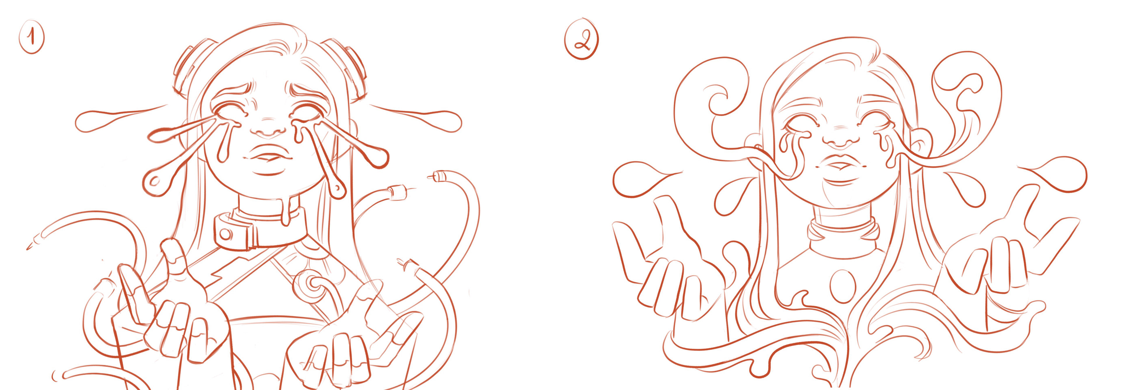
Main Illustrator: Trinh Tran
Main Illustrator: Trinh Tran
OVERVIEW OF THE GAME:
A dungeon clearing and reinforcing game set in a network-scape realm. All monsters, punishments, and effects are based on real-world hacking consequences to a poorly protected network.
The game's main elements:
The Playing Board, Virus (monster) Cards, Character Cards, Event Cards, and Loot Items.
The Playing Board, Virus (monster) Cards, Character Cards, Event Cards, and Loot Items.
From CCI Page:
"The project proposes to use gamification, which is when various aspects of game playing such as rewards, badges, quests, and competitive standing are used to heighten user engagement with a product or service. The proposed project will leverage a user-centered design process to develop a mobile application prototype that will gamify cybersecurity education and assessment. Artists from a variety of fields are involved in developing assets for the game. To further facilitate widespread user engagement with cybersecurity, the project will also use abstraction: the process of simplifying more complex concepts so that they can be consumed by a larger audience."
"The project proposes to use gamification, which is when various aspects of game playing such as rewards, badges, quests, and competitive standing are used to heighten user engagement with a product or service. The proposed project will leverage a user-centered design process to develop a mobile application prototype that will gamify cybersecurity education and assessment. Artists from a variety of fields are involved in developing assets for the game. To further facilitate widespread user engagement with cybersecurity, the project will also use abstraction: the process of simplifying more complex concepts so that they can be consumed by a larger audience."
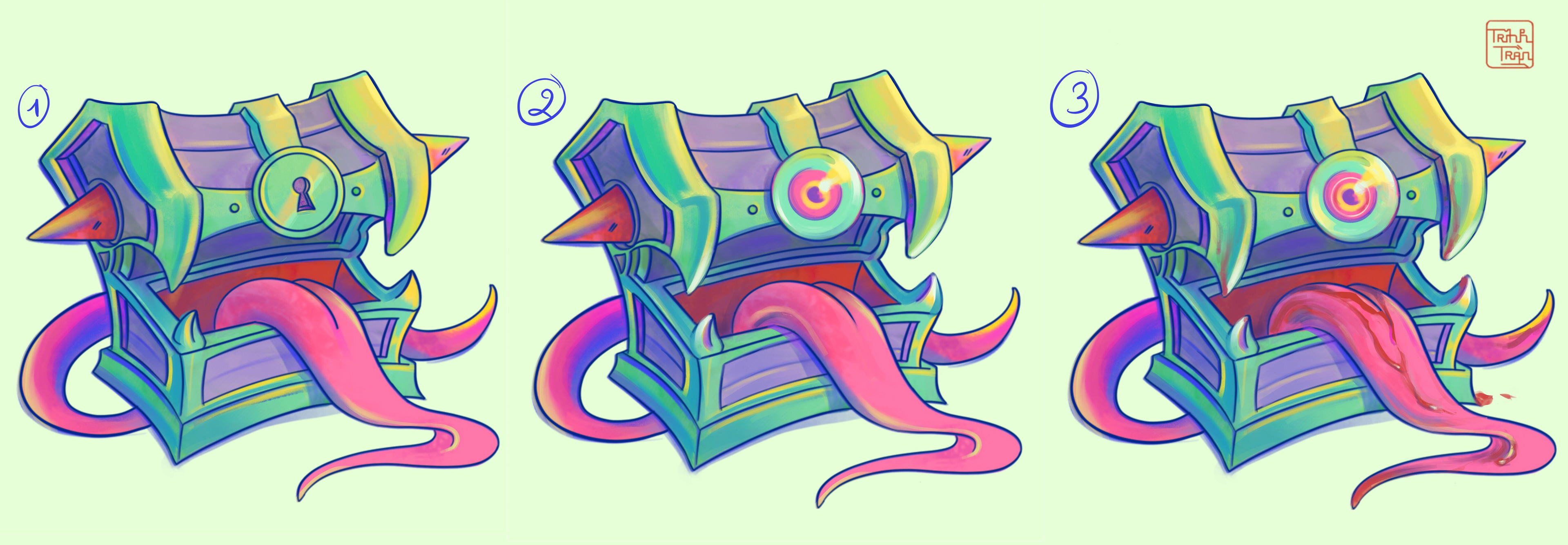
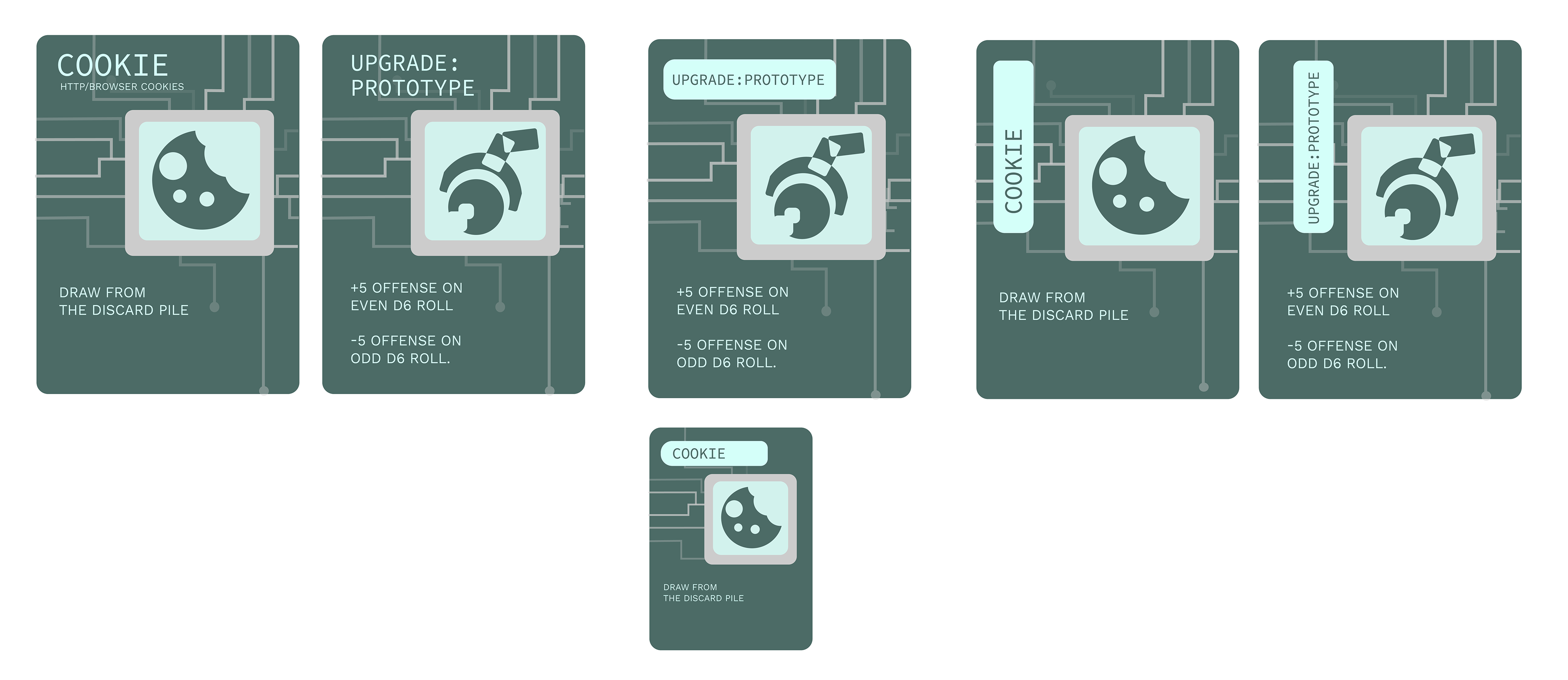
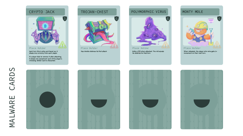
Below are images showcasing the design process of the monster and loot cards.
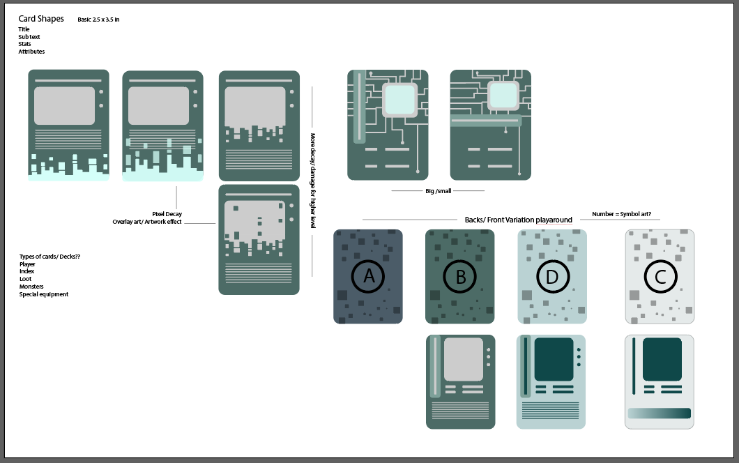

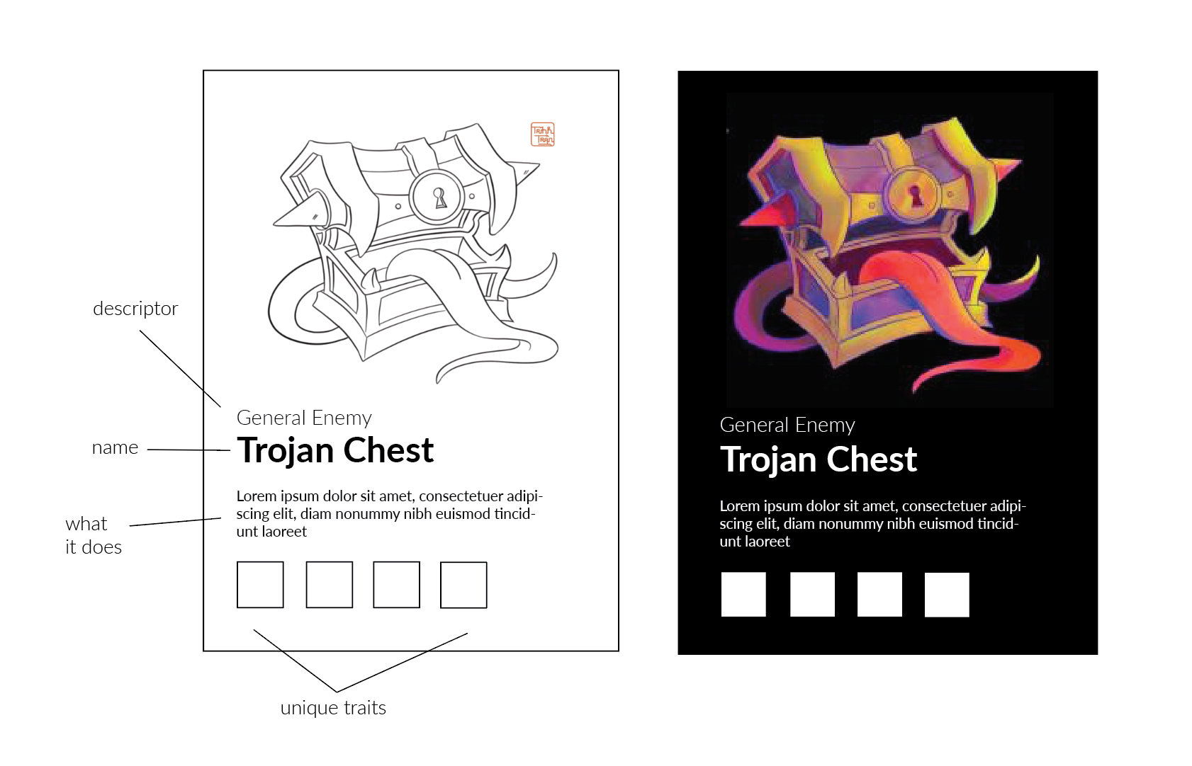
By the final prototype, some monster cards would remain hidden while others would be flipped over once at the top of the deck so we needed some kind of indicator on the back of the card to tell the player when to flip the card over.
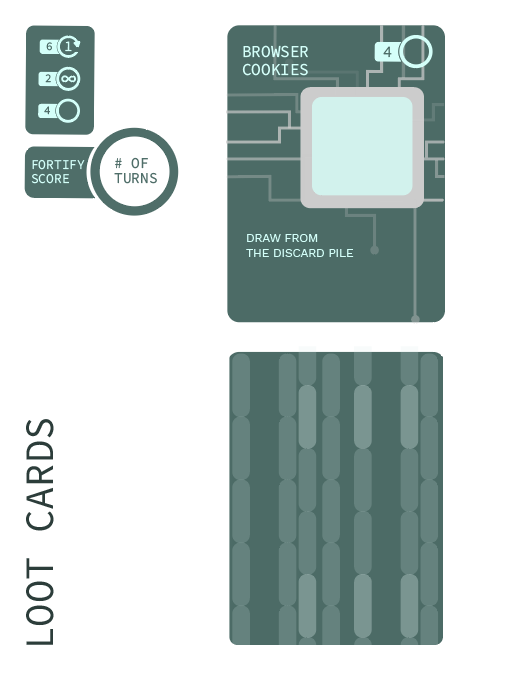
Loot Cards need to have a layout that would be flexible and adapt to the wide range of abilities and restrictions they allowed. A small graphical icon would be placed in the chip square.
Loot Cards need to have a layout that would be flexible and adapt to the wide range of abilities and restrictions they allowed. A small graphical icon would be placed in the chip square.
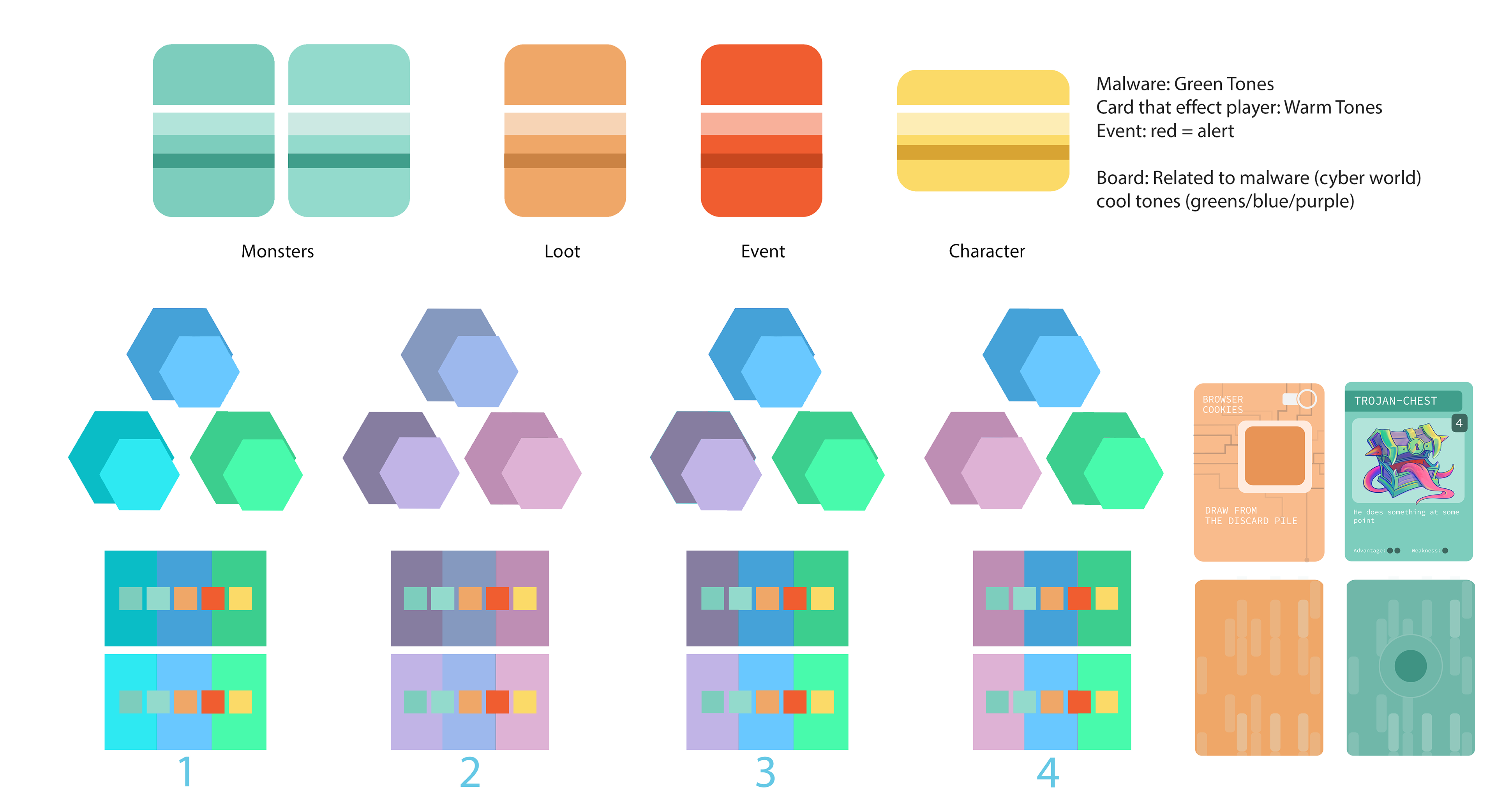
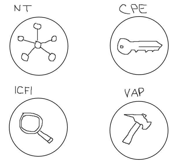
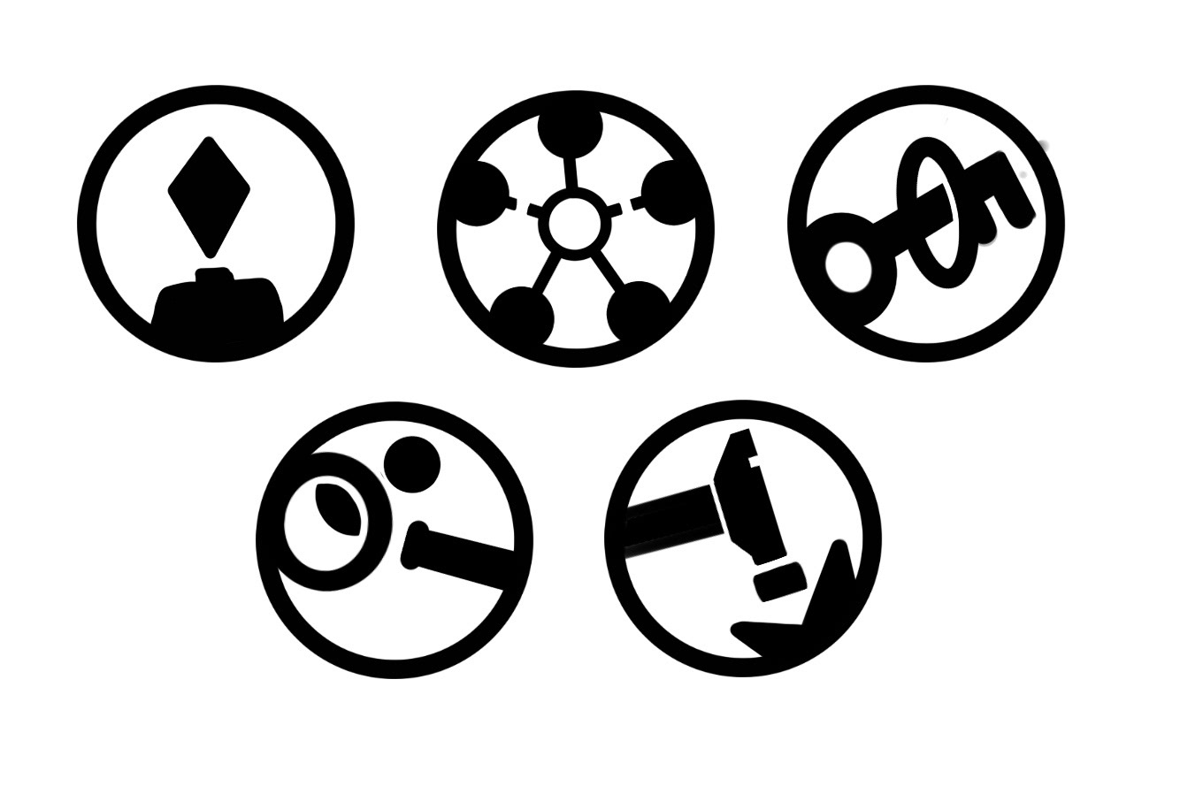
Players would have unique abilities depending on the character they were playing as. This class system would later be implemented more into the mechanics making certain classes more effective against certain monsters/ hacks meaning we need a simple easy to use symbol system that could be used in multiple places.
Near the end of prototyping, we finally had an idea of the range of elements present in the game and their relationship to the players and each other. Below is a color branding board. Bright colors that stepped away from the organic feeling to really push the digital nature of the game were requested but a wide range of colors was needed to make sure visually plays could easily tell what each card was and how it could be played.